I have always been fascinated by charts and graphs. Charts can convey information far more quickly than paragraphs. And are easy to refer to later.
Today we'll look at some of the best libraries for Python that will cater to most of your data visualization needs.
Matplotib
You can't talk about data visualization in Python and not mention Matplotlib.
Matplotlib is a Python 2D plotting library which produces publication quality figures in a variety of hardcopy formats and interactive environments across platforms. Matplotlib can be used in Python scripts, the Python and IPython shell, the jupyter notebook, web application servers, and four graphical user interface toolkits.
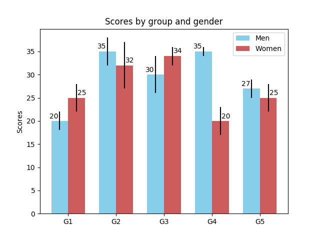
An example of the bar chart in matplotlib:
Seaborn
Seaborn is a Python visualization library based on matplotlib. It provides a high-level interface for drawing attractive statistical graphics.
Seaborn aims to make visualization a central part of exploring and understanding data. The plotting functions operate on data frames and arrays containing a whole dataset and internally perform the necessary aggregation and statistical model-fitting to produce informative plots. If matplotlib “tries to make easy things easy and hard things possible”, seaborn tries to make a well-defined set of hard things easy too.
Example of bar plot in Seaborn:
Bokeh
Bokeh is a Python interactive visualization library that targets modern web browsers for presentation. Its goal is to provide elegant, concise construction of novel graphics in the style of D3.js, and to extend this capability with high-performance interactivity over very large or streaming datasets. Bokeh can help anyone who would like to quickly and easily create interactive plots, dashboards, and data applications.
An example of bar plot in Bokeh:
pygal
Like Bokeh, pygal offers interactive data visualization.
pygal is a dynamic SVG charting library written in python. All the documentation is on www.pygal.org
An example of bar plot in pygal:
Plotly
Plotly creates leading open source tools for composing, editing, and sharing interactive data visualization via the Web.
Plotly is famous as online data visualization tool. But it can also be accessed offline and used in Jupyter notebooks.
An example of Plotly's bar plot:
ggplot
ggplot is a plotting system for Python based on R's ggplot2 and the Grammar of Graphics. It is built for making professional looking, plots quickly with minimal code.
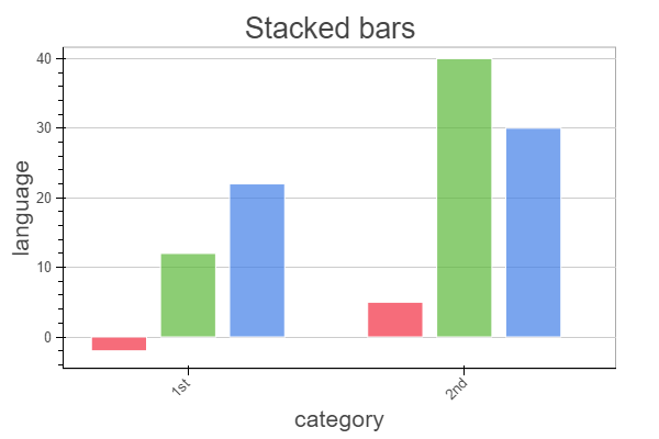
Example of data plot with ggplot:
That's it. I hope you'll give these libraries a try and enjoy playing with data.
Keep coding.